Latitude: Does it really make a difference?
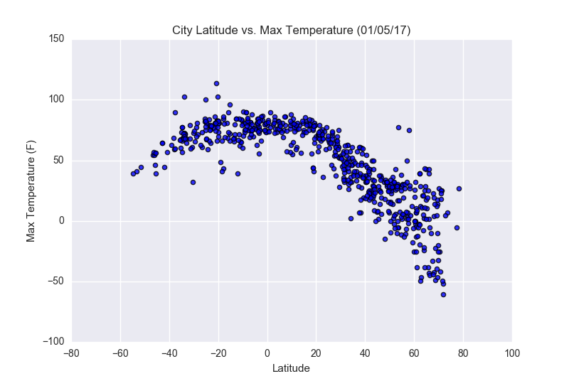
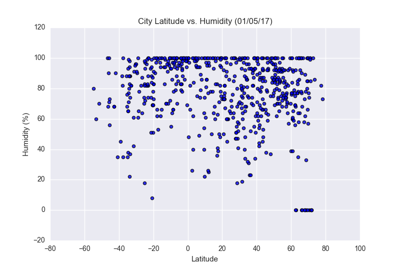
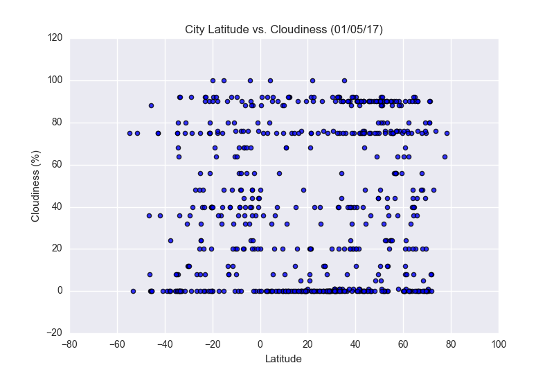
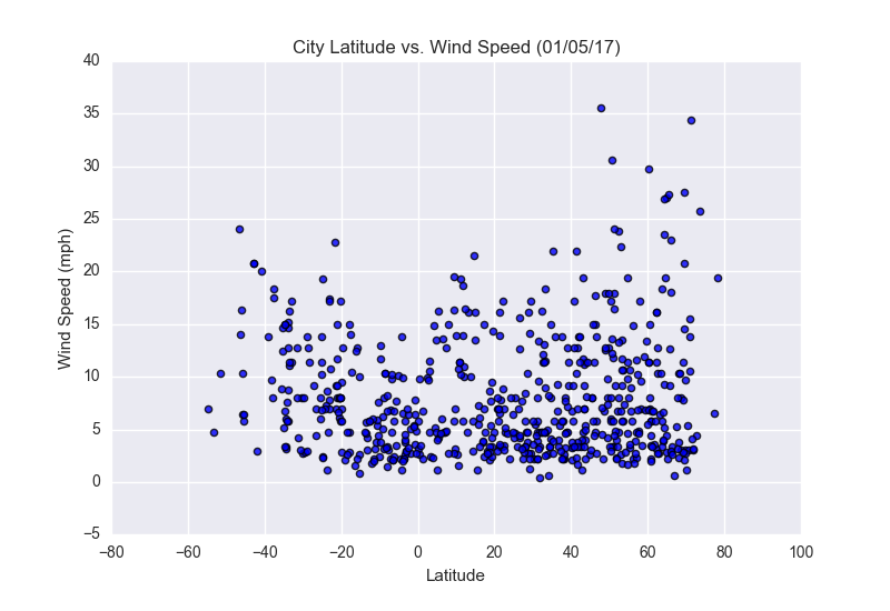
This project was compiled from the OpenWeatherMap API using current data to create the 4 visualizations, shown here. Starting with a city's latitude in reference to the equator, and comparing that data with other metrics to find any type of correlation. This analysis was one on a dataset of over 500 cities randomly selected from the API.
After importing the data and creating visualizations on temperature, cloudiness, wind speed, and humidity as they compare to latitude using MatPlotLib. A smaller analysis was done on that project. However this website aims to provide a little more insight along with an easier to navigate way to view the data.
MatPlotLib Plots